


Gemini Notebook sites can turn a notebook’s sources into an interactive tool, adding a new way to explore research and project information. Google announced the feature on November 16, 2026, with a global web rollout for adults, including Workspace subscribers; mobile availability was described as coming later. The useful question is whether the generated tool behaves correctly and can be shared appropriately for your task.
This guide focuses on a small project tracker you can inspect before relying on it. Product details were checked on November 17, 2026. The example data, prompts, and test cases are original editorial exercises. They are not real product screenshots, a hands-on review, or proof that every suggested behavior will generate successfully.
What Gemini Notebook sites add
Google’s launch announcement describes creating interactive sites from sources by asking for a site in notebook chat. Examples include visual learning materials, dashboards, and project trackers. That opens a useful possibility: readers can explore selected information through controls rather than reading one static summary.
Treat the output as a candidate tool. A page can look professional while filtering the wrong records or labeling a calculation incorrectly. The quality check therefore needs two parts: the underlying information must be sound, and the interaction must preserve its meaning.
For the first part, our Gemini Notebook source-checking guide covers freshness, approval, and citation support. Here we build on that foundation by examining generated behavior, test cases, and the practical consequences of sharing.
Start with one decision, not an entire application
Choose a decision the site should help someone make. For a fictional design team, it might be: “Which approved tasks need attention this week?” That is a manageable purpose for a tracker. It does not require payments, account registration, private client documents, or a connection to a live project-management system.
Prepare a short source document with a task name, responsible role, due date, and status for each item. Use invented names and harmless sample information for the first attempt. Define the allowed statuses explicitly, such as planned, in progress, and complete. Do not leave the assistant to infer whether a blank cell means unknown or finished.
Write the acceptance rule in ordinary language: a user should be able to filter incomplete tasks, see the relevant due dates, and identify missing dates without losing records. This rule gives you something concrete to test after generation. A request for a beautiful dashboard does not.
A bounded prompt for your first prototype
Google’s site-generation help says creation requires notebook edit access. Open the notebook and request a site in chat; generated sites can be accessed through Studio. Consult that help page for the current menu labels if your interface differs.
Try this original prompt with your sample source:
Make a site for reviewing the supplied fictional project tasks. Show the task name, due date, status, and responsible role. Add a status filter and a clear reset control. Keep items with missing dates visible in a separate undated group. Use only the supplied tasks. Do not invent completion percentages or treat missing values as zero. Include a short explanation of the fields and label this as a prototype for review.
The prompt describes desired behavior, not guaranteed functionality. If a control is omitted, first check whether the basic records are correct. Then ask for one focused change. Trying to repair data, layout, and calculations in a single broad instruction makes it harder to determine what changed.
Our guide to writing clear prompts offers related examples of defining audience, context, and output structure. For interactive work, add a testable behavior to those ingredients.
Compare the output format with the task
The following table is editorial decision guidance, not a claim that one format always performs better. Choose the smallest deliverable that lets the intended reader do the job.
| Need | A static brief may be enough when | An interactive prototype may help when |
|---|---|---|
| Review a few findings | Everyone needs the same short explanation | Readers need to select categories or explore examples |
| Inspect tasks | The list is short and changes rarely | Different roles need filtered views |
| Explain a process | A clear sequence answers the question | Readers benefit from choosing a scenario |
| Maintain shared operational records | A document already fits the process | Only after persistence, permissions, and collaboration are verified |
Avoid equating interactivity with usefulness. If the reader must learn several controls to find one answer, a well-written paragraph may work better. Conversely, repeated manual sorting can justify a simple filter. The decision should follow the reader’s task, not the novelty of the format.
Test the records before the visual design
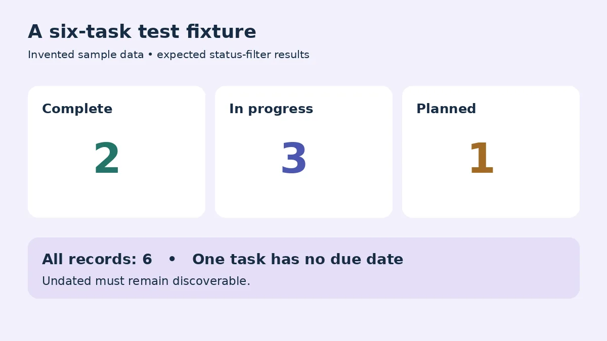
Create a tiny reference set whose expected results you can calculate yourself. For example, use six fictional tasks: two complete, three in progress, and one planned. Give one task no due date. Record the expected count for each filter before touching the generated page.
First compare the unfiltered view with the source. All six records should appear exactly once. Check names, dates, and status labels. A missing row is an information error, even if the total displayed elsewhere looks plausible. A duplicated row can also inflate a count or distort the apparent workload.
Then select each status. The complete view should contain the two complete tasks, and the other views should follow the sample definitions. Clear the filter and confirm that every record returns. Check whether the undated item remains discoverable instead of disappearing from a date-based view.
Finally, change one harmless sample value through the intended workflow and inspect the relevant output. This tests your assumptions about updates. Do not infer automatic synchronization, collaborative editing, or live-source behavior from the fact that a site was generated from a notebook.
Give calculations their own acceptance checks
If you request totals or percentages, define the calculation explicitly. “Completion rate” might mean completed tasks divided by all tasks, or only by tasks due this week. Those are different measures. The label, denominator, and treatment of missing information must agree.
With six tasks and two complete, a task-count completion rate would be two divided by six, approximately 33.3 percent. That arithmetic is an illustrative test fixture, not a claim about a real project. If the page shows something else, inspect its assumptions before changing the source to match the display.
| Test case | Expected behavior to specify | Problem it can reveal |
|---|---|---|
| No matching tasks | Explain that the result is empty | Blank screen mistaken for a failure |
| Missing due date | Keep the item visible as undated | Silent exclusion from planning |
| Reset after filtering | Restore the original complete set | Sticky state or hidden rows |
| Long task title | Keep the full meaning accessible | Clipped information on mobile |
| Changed sample status | Reflect the documented update workflow | Stale output or incorrect assumptions |
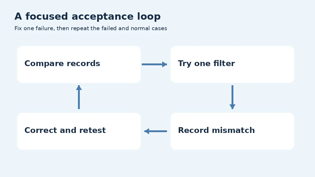
Keep a short record of failures with the action, expected result, and observed result. “The planned filter hides the undated task” is actionable. “The site is bad” is not. After a correction, repeat the failed test and a nearby normal case to catch unintended changes.
Understand sharing before inviting a client
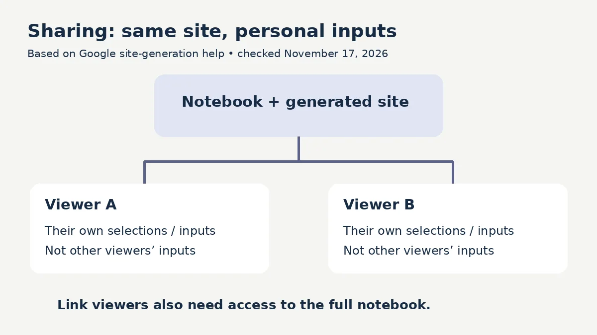
Google’s current help says shared-site inputs are personal to each viewer: people do not see one another’s inputs. It also says link recipients need access to the full notebook. Public sharing is described for consumer-account owners or editors. These conditions matter when a prototype contains information intended for a limited audience.
Do not describe a personal checkbox view as a shared team task database. Two people may see the same initial material while their interactions remain separate. If coordinated updates are essential, verify that the selected workflow actually supplies them before asking the team to adopt it.
Create a separate demonstration notebook containing only material approved for its recipients. Review its sources as well as the generated site. A harmless-looking dashboard is not a substitute for checking what the associated notebook exposes.
Google documents a download option and notes that disabling sharing or deleting a site stops previously generated share links. A downloaded copy is a separate practical consideration: do not promise that revoking a link retrieves files people already received. Use your organization’s normal process for distributing and maintaining copies.
Keep usage and maintenance proportionate
The usage-limit documentation describes compute-based allowances affected by the request and features used. Check Settings and Usage for your own account. A fixed number of sites per day or a guaranteed cost per generation is not established by the launch announcement.
For an economical first attempt, use a short approved source, a modest interface, and one revision goal at a time. Save your acceptance checklist before generation. That lets you focus revisions on correctness instead of repeatedly requesting a different visual style without solving the underlying problem.
Name an owner for the prototype and give it a review date. State whether the source is a demonstration dataset or real approved information. If the data or process changes, identify the affected outputs and test them again. A tool that was useful last month can become misleading if its assumptions no longer match the work.
Before handoff, inspect the site at a narrow screen width. Try the controls with a keyboard, check readable labels, and verify that long text and empty states remain understandable. These are practical acceptance checks, not a claim of formal accessibility certification.
Frequently asked questions
Is the sites feature available on mobile?
Google’s November 16 announcement describes a web rollout and says mobile support is coming later. Check the current official announcement or your account before planning a mobile-only workflow.
Is a generated tracker automatically a shared database?
No. Google says viewers’ site inputs are personal rather than visible to other viewers. Confirm any collaboration requirement separately; do not assume checking an item updates a team-wide record.
What should I test first?
Compare the original records with the unfiltered view, then check one simple filter against a known answer. Resolve missing or duplicated information before spending time on appearance.
Should every source summary become a site?
No. Use interactivity when it helps a reader explore choices or filter information. A static explanation can be easier to review when everyone needs the same short answer.
Can I use the example prompt with real client material?
Only after confirming that the material and account are appropriate for that use. Start with fictional data, inspect notebook access, and obtain the approvals required by your normal client workflow.
Decide after a small acceptance test
Gemini Notebook sites are worth evaluating when a source-based interactive view serves a clear purpose. Build a small prototype, test its records and controls, and understand its sharing boundary. Keep the tool only if those checks show it helps the intended reader do a specific job.